Brand Guidelines
Scroll
ConnexPay Brand Site
Welcome!
We have created this to connect our partners and collaborators so the ConnexPay brand is experienced consistently across all uses and mediums.
Correct Pronunciation
[kuh-nex-pey]
Brand Mark
The ConnexPay logo is a custom wordmark that visually represents our brand name. Its geometric form reinforces clarity and trust, while the stylized “X” at the center highlights our mission to connect payments in a seamless way. The enclosing shape gives the mark a strong, unified structure, helping it stand out across both digital and physical contexts.
This section provides guidance on how to use our logo consistently and correctly. You'll find information on usage and color options, as well as downloadable assets.
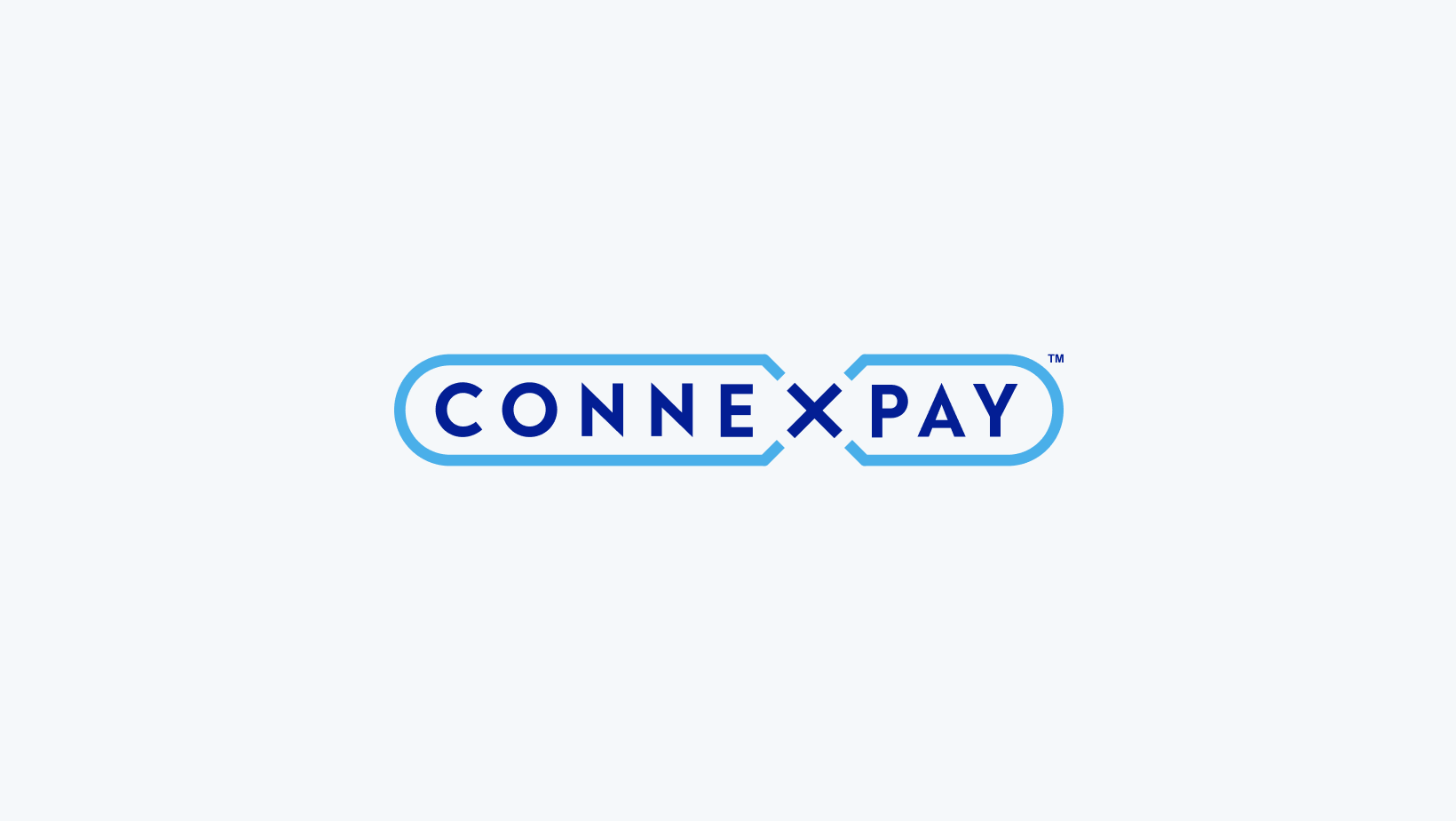
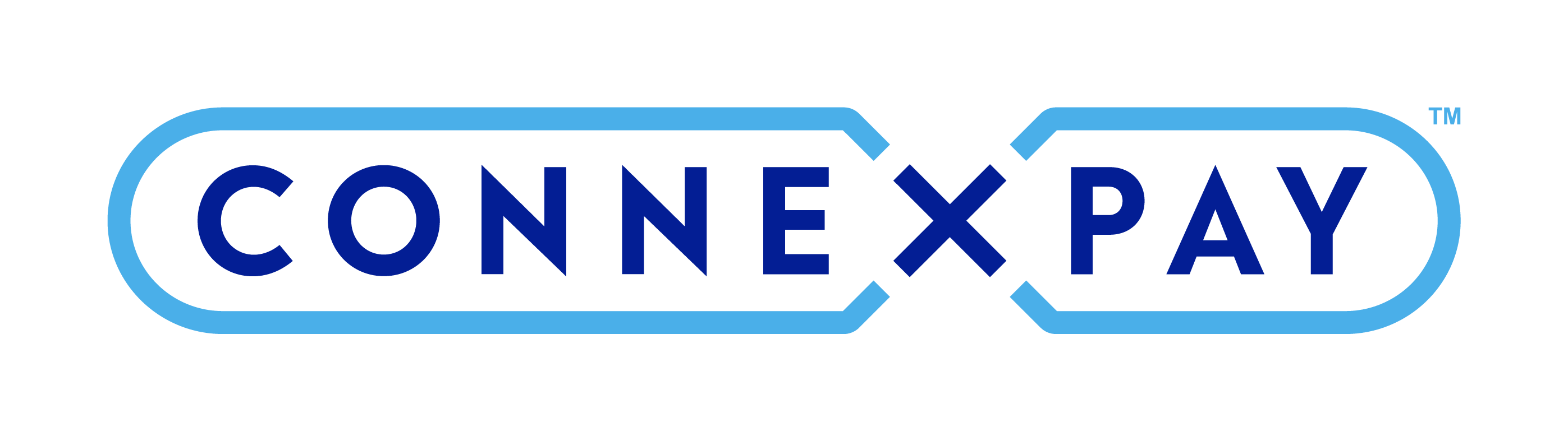
Primary Logo
This full-color version of the logo, featuring Pulse Blue and Resolute Blue, is the default and preferred treatment. It should be used in most standard applications, especially on light backgrounds. We use this primary logo consistently across all branded materials. There is no standalone icon or alternate mark.
2. Optional in swag, marketing materials, events.
Logo Color Guidance
To ensure consistency across various backgrounds and formats, the ConnexPay logo is available in the following approved color combinations:
.avif)
Pulse Blue + Resolute Blue (Full Color)
.avif)
White + Pulse Blue
.avif)
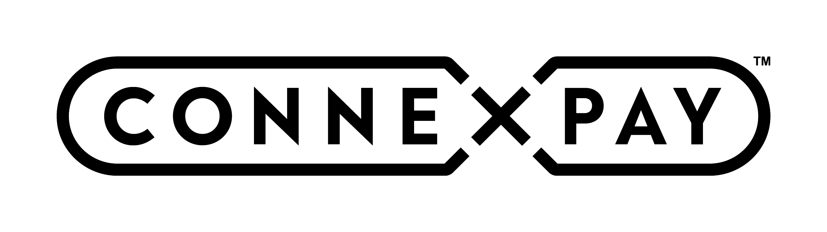
Oxford Black (Monochrome)
.avif)
White (Monochrome)
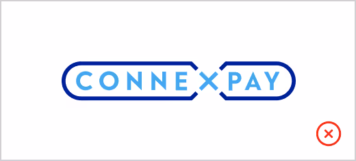
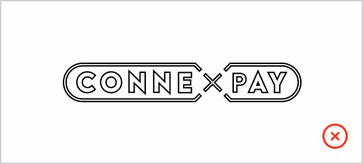
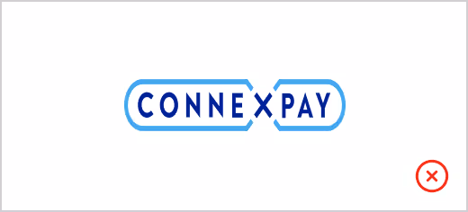
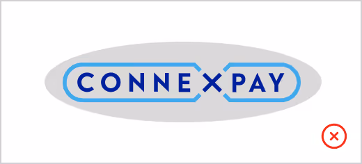
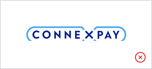
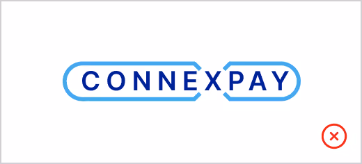
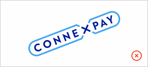
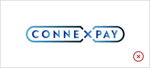
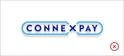
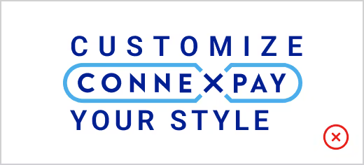
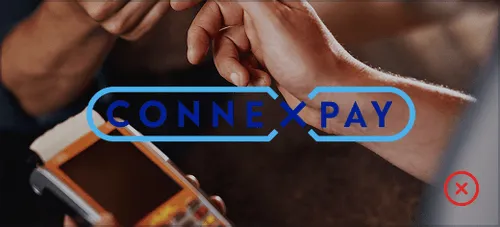
Incorrect Uses
To maintain brand consistency, the examples below show incorrect uses of the ConnexPay logo that should be avoided.
Typography
ConnexPay uses Roboto Slab for headlines and Roboto for body text as its primary typefaces. These fonts were selected for their clarity, versatility, and modern appearance, making them suitable for both digital and print applications.


Colors
A look at our overall color approach, core brand colors, color palette for web, neutral palette, complementary palette, and more.
Core Brand Colors
ConnexPay is a blue-first brand. We use two core blues—Resolute Blue and Pulse Blue—to reflect trust, security, and clarity. These colors form the foundation of our visual identity and are used across our logo, interface elements, and marketing materials.
To support moments of emphasis, we also include two accent colors:
- Spark Green is used sparingly to bring energy and draw attention to actions.
- Signal Green offers a deeper, grounded tone and is used to reinforce stability in visual applications.
Neutral Palette
Color Accessibility
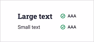
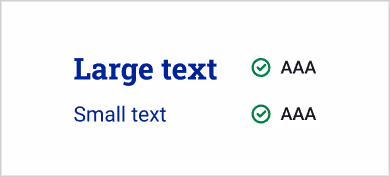
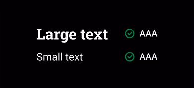
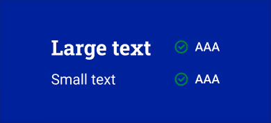
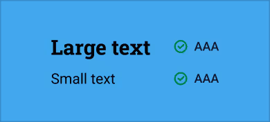
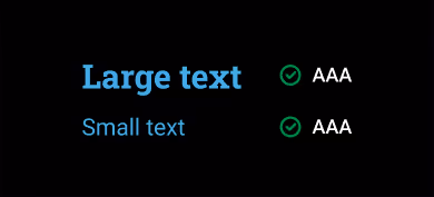
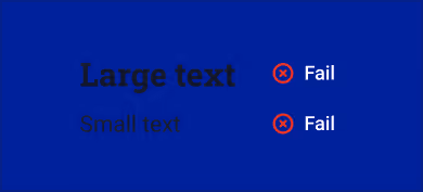
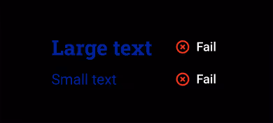
Contrast and legibility are evaluated using contrast ratios. According to WCAG 2.1, the minimum contrast ratio for text to meet Level AA compliance is 4.5:1. For large text or headings, a minimum of 3:1 is required.
You can check if your color combinations meet accessibility standards using Coolors.
Acceptable Uses (pass AAA)
Unacceptable Uses

Icons
Our icon set is a toolbox for creating supporting graphics and they are based on icons from IconPark. The icons are always used in our brand colors and in an outlined version like shown below.
Icon Construction
Icons follow a consistent grid system to ensure clarity, balance, and visual alignment across all touch-points. Always use the provided icons as-is, and avoid distorting or stretching.
With Grid

Without Grid